I had a few ideas with what I wanted for the Finding Fairfield logo. One of them being the gazebo that is in the town’s center. After working on that for a few days, I scrapped that. Then I thought about doing was having the gazebo on the left and the lifeguard chair to the right and in the middle having the words “Finding Fairfield”. The photo I have of the lifeguard chair was too close and after looking at it for about a week it didn’ look right. I ended up taking a break from it, and concentrated more on Finding Westport design work that needed to be done, and then came back to it recently. I was telling a friend of mine, that I feel like I couldn’t move forward with the website, the digital newsletters
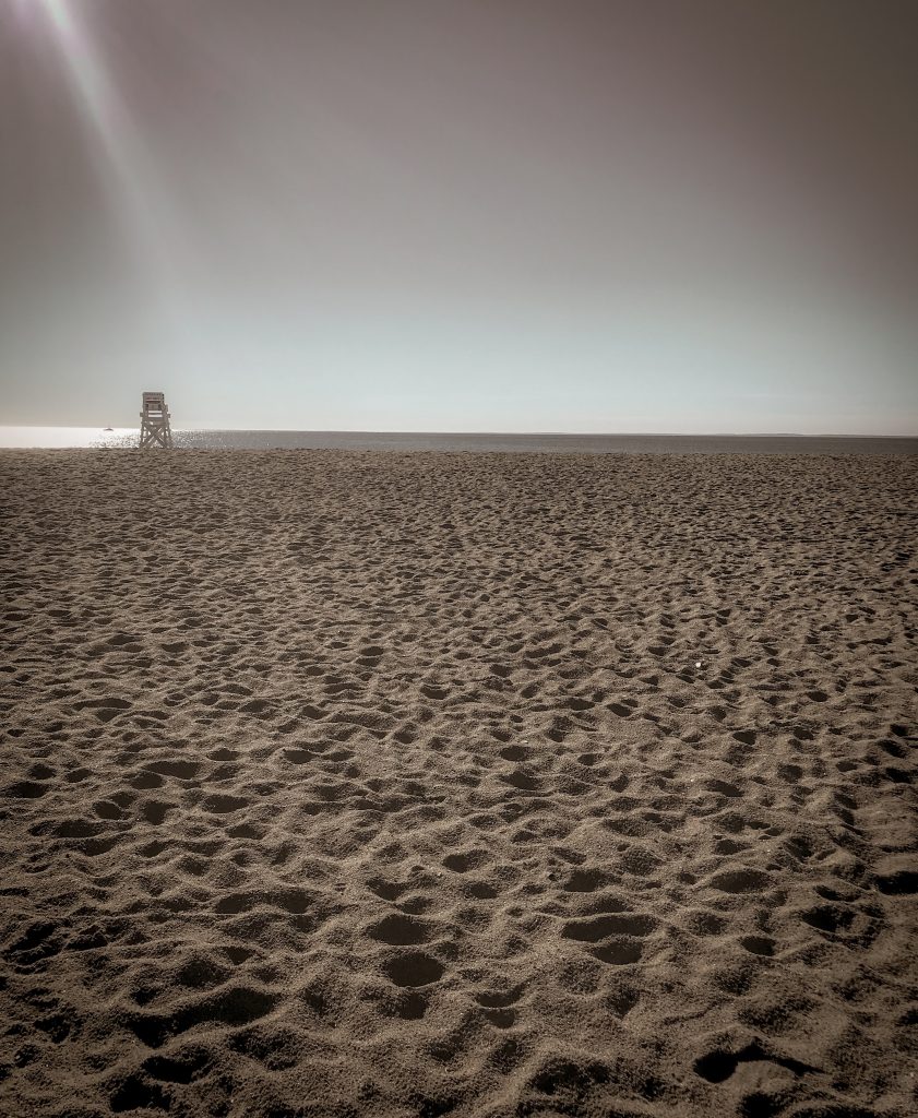
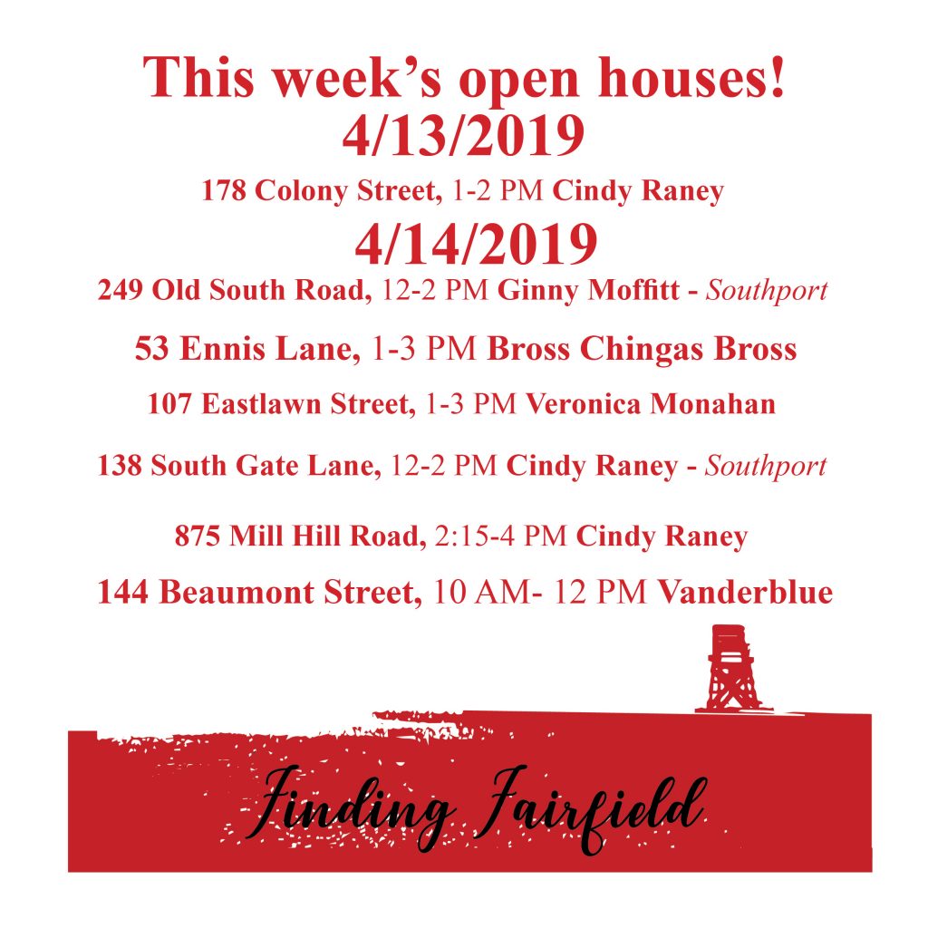
This afternoon, I finally finished it. I’m really excited about the outcome! What I did was I wanted something that symbolizes Fairfield, the one thing that comes to mind is the lifeguard chairs at Jennings beach. I took the photo below was trying to transform it into a local scene like Finding Westport’s logo. When I turned the photo below into a vector image I wasn’t happy with the outcome and felt I could design something better.


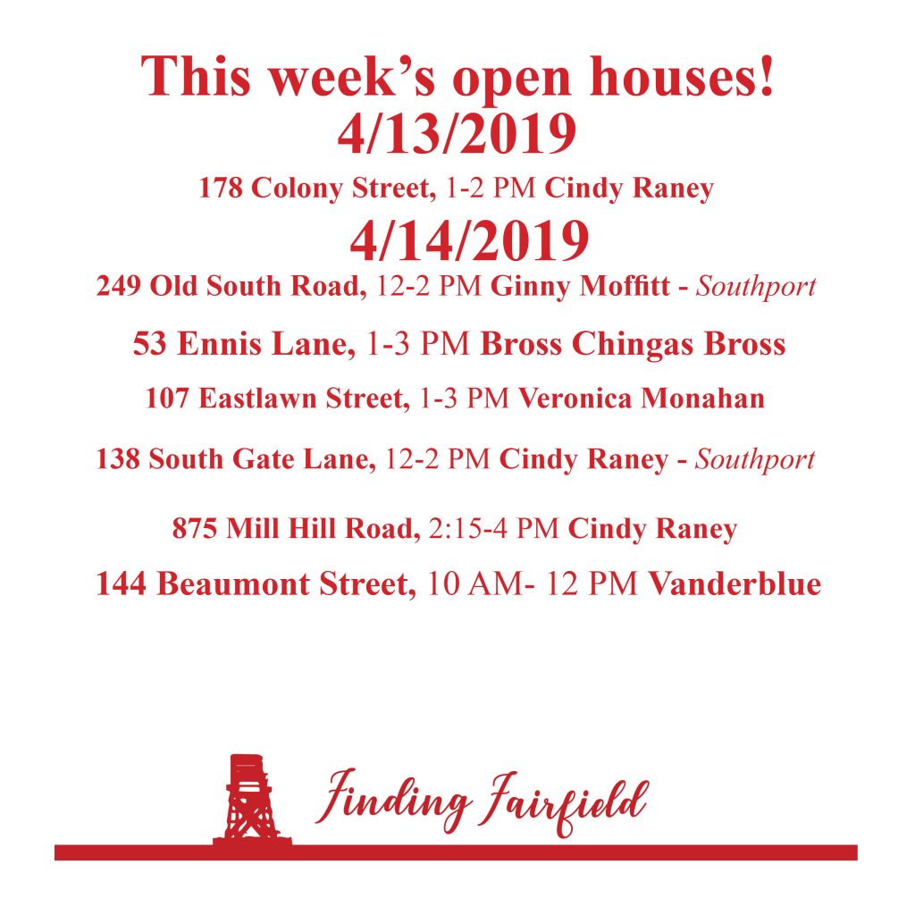
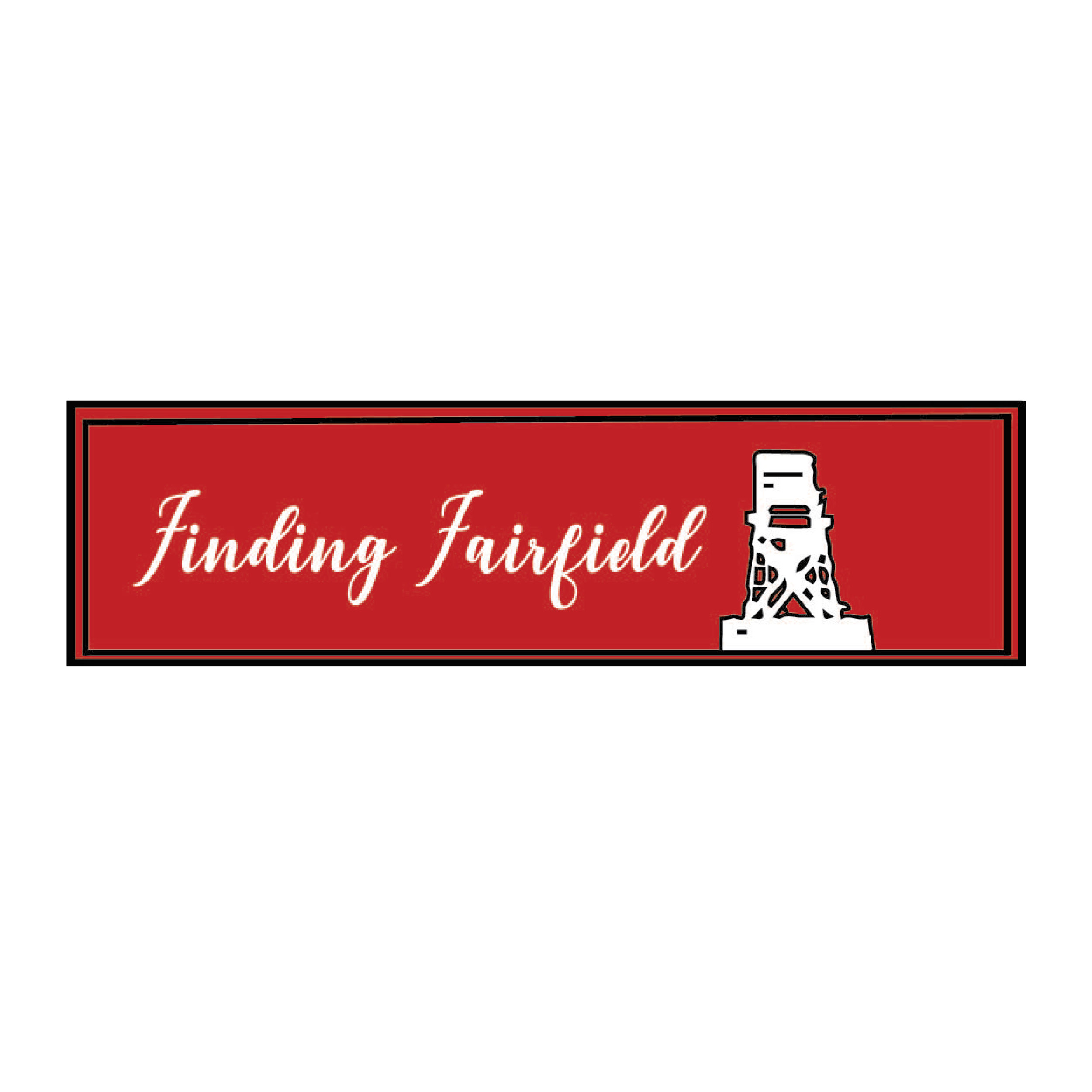
The final
Below is the final. I really like this one. The lifeguard chair is big enough that anyone who has any association with Fairfield knows what it represents. I went with red, white because those were the originals I picked when I was setting up the Open House lists, I added the black to give it a border. I’m sure over time, I will change it again, but I really like how this came out.

